Start with the light in your room
The single biggest factor in how a paint colour looks is the light in the room. A colour that looks warm and inviting in a south-facing room can look cold and flat in a north-facing one. Natural daylight, artificial lighting, and even the time of day all change how colours appear.
Before committing, always test paint colours in the actual room. Paint a large sample patch (at least A3 size) on the wall and look at it at different times of day. Many paint brands sell sample pots for a few pounds — it's the best money you can spend.
Consider the size of the room
Light colours make small rooms feel bigger and more open. Dark colours can make a large room feel cosier and more intimate. This doesn't mean small rooms can't have dark walls — a dark feature wall in a small bedroom can look stunning — but it's worth thinking about the effect you want.
If you're painting a hallway or landing, lighter colours tend to work best as these spaces often have limited natural light. For living rooms and bedrooms, you have more freedom to experiment.
Work with what you already have
Unless you're starting from scratch, your paint colour needs to work with your existing flooring, furniture, and curtains. Pull colours from what's already in the room — a cushion, a rug, or a piece of artwork can be a great starting point.
If you have warm-toned wood floors or furniture, warm paint colours (creams, warm greys, sage greens) tend to complement them. Cool-toned rooms suit cooler shades (blue-greys, whites with a blue undertone).
Popular colour choices I see in Bath
In the period properties and character homes I work on across Bath, I see a lot of heritage colours performing well. Sage greens, deep navy blues, warm whites, and soft greys are consistently popular choices that suit both traditional and modern interiors.
Farrow & Ball colours like Hague Blue, Pigeon, and Cornforth White remain popular in Bath homes. Dulux Heritage and Little Greene are also excellent ranges for character properties. I'm happy to advise on colours and can colour-match to any shade.
Don't forget the woodwork
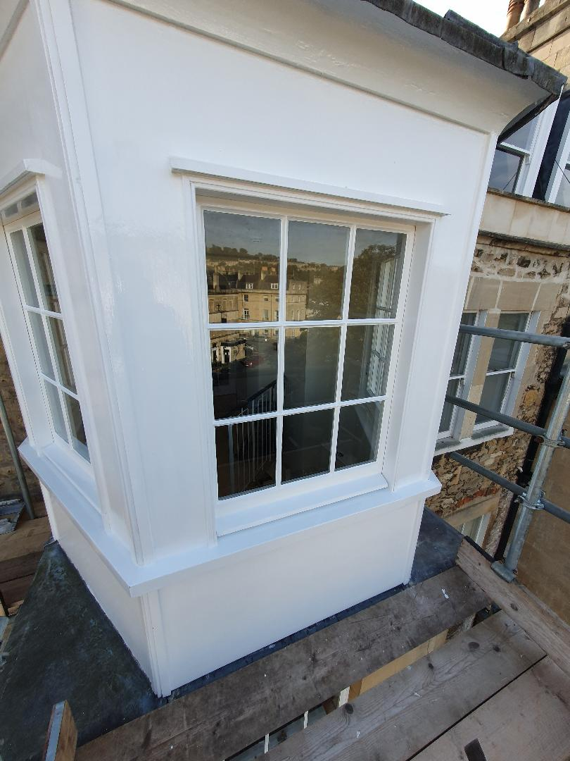
Skirting boards, doors, and architraves frame the room and can make or break the overall look. Bright white woodwork gives a clean, contemporary feel. Off-white or a shade lighter than the walls creates a softer, more traditional look.
Some homeowners are now choosing to paint woodwork in the same colour as the walls for a modern, seamless effect. Others go bold with a contrasting colour on doors. Whatever you choose, make sure you use the right finish — satinwood or eggshell for woodwork, matt or silk for walls.
New Decorating
Professional painter and decorator based in Bath with over 25 years of experience. Fully insured. Free quotes across Bath and BANES.